The Showroom Trap
Walk into most furniture showrooms and you'll see the same thing: a bed, two bedside tables, a dresser, and a mirror, all cut from the same timber and finished in the same stain. It looks tidy under showroom lights. At home, it looks like a catalogue page.
Perfectly matched wood creates a flat room. With no variation in tone, the eye has nothing to compare against, so the grain, the craftsmanship, and the form of each piece blur into one mass of brown. Matching also rarely survives real life. Floors are installed years before furniture is bought, heirlooms arrive, and wood ages at different rates. A cherry cabinet darkens and a walnut table lightens, so a "matched" set drifts apart within a few years anyway.
Well-designed interiors treat wood the way a tailor treats cloth. One dominant fabric sets the tone, and one or two deliberate contrasts give it depth. Knowing how to mix wood tones in interior design is less about taste and more about following a few reliable rules: read the undertone, set a dominant anchor, and make contrast unmistakable rather than accidental.
Step 1: Identifying the Undertone
Every wood has two properties you need to separate: value (how light or dark it is) and undertone (the color temperature beneath the surface). Most clashing wood schemes fail on undertone, not value.
Warm undertones
These woods lean red, orange, or yellow.
- Cherry: red-pink, and darkens noticeably toward deep reddish-brown with light exposure.
- Red oak: a distinct pink cast, most visible next to white oak.
- Mahogany: red-brown.
- Teak: golden-orange, and rich in natural oils.
- Honey-stained maple or pine: yellow-amber.
Cool undertones
These woods lean gray, taupe, or faintly violet.
- Unfinished or fumed walnut: chocolate with a gray-violet cast.
- Ebonized or charred woods: near-black and neutral-cool.
- Weathered, gray-washed, and cerused finishes: gray.
- Smoked oak: cool, deep brown.
Neutral undertones
- White oak: light, with a slight greenish-gray to beige cast.
- Ash: pale and fairly neutral.
- Natural-finish maple: creamy.
Neutral woods are the most forgiving partners because they sit comfortably beside both warm and cool species.
How to read undertone in practice
Hold the wood beside a sheet of plain white paper in daylight, not under warm LED bulbs. Look past the brown and ask what color remains: red, yellow, gray, or green. For a quicker check, compare it with a known reference. If a sample looks pink next to white oak, it's warm. If it looks gray next to teak, it's cool.
The core rule: keep undertones in the same family, or introduce a neutral as a bridge. A warm cherry dresser on a cool gray-washed floor fights. The same dresser on white oak works, because the neutral oak absorbs the tension.
Step 2: The Dominant Anchor and the 80/20 Rule
The 80/20 rule gives your scheme a hierarchy. Roughly 80% of the visible wood in a room should share one tone, the dominant anchor. The remaining 20% is where you introduce contrast.
What counts as the anchor
The anchor is almost always the largest wood surface in the room:
- Flooring, in most homes.
- Built-in millwork, such as wall paneling, kitchen cabinetry, or a full wall of bookshelves.
- Ceiling beams or timber cladding, in rooms with exposed structure.
Because these elements are hard or expensive to change, they set the terms. Your furniture choices follow from them, not the other way around.
Applying the 80/20 split
Picture a living room with white oak flooring. The 80% is the floor itself plus a white oak media unit and shelving. The 20% could be a walnut coffee table and a walnut-framed armchair. The oak reads as the room's baseline, and the walnut reads as a deliberate accent.
The ratio doesn't need to be measured precisely. It's a visual weighting, not arithmetic. What matters is that one tone clearly leads. When two woods each take up about half the room, the space feels undecided, as if two separate rooms had been merged.
Repeat the accent at least twice
A single walnut piece in an oak room can look like an orphan, as if it wandered in from another house. Repeat the accent wood at least twice, at different scales: a walnut coffee table and walnut picture frames, or a walnut dining table and a walnut serving tray on the sideboard. The repetition signals intent.
Step 3: High Contrast vs. Accidental Clashing
This is where most people go wrong. The instinct when buying new furniture is to find a wood "close to" what you already have. That instinct produces the worst results.
Why near-matches fail
Two woods that are almost the same tone never look intentional. They look like a failed attempt at matching. A mid-brown oak table on a slightly different mid-brown oak floor makes the eye register a difference without understanding it, which reads as a mistake.
Why clear contrast works
When the values are distinctly different, such as pale ash against deep walnut or light white oak against near-black ebonized wood, the eye reads the contrast as a decision. Mixing light and dark wood furniture works precisely because the gap is too large to be accidental.
As a working guideline, aim for a difference of at least two to three shades between the anchor and the accent. If you squint and the two woods merge into one tone, they're too close.
Grain and sheen matter too
Contrast isn't only about color.
- Grain scale: pair a busy, prominent grain like oak's cathedral figure or teak's streaks with a quieter, tighter grain like maple or walnut. Two loud grains side by side compete.
- Sheen: keep finishes within a similar range. A matte oiled floor beside a high-gloss lacquered table highlights the finish rather than the wood. Most modern interiors sit comfortably in matte to satin.
Practical Buffer Techniques: Creating Visual Air
Even well-chosen contrasting woods benefit from separation. A buffer is any material placed between two wood tones that gives the eye a rest before it moves on.
Rugs
The most effective buffer, and the most underused. A wool or jute rug between a walnut coffee table and a white oak floor means the two woods never touch visually. Choose a rug with a tone that sits between both woods or picks up the undertone they share.
Metal accents
Matte black hardware, lamp bases, and furniture legs act as a hard full stop between woods and suit both warm and cool schemes. Aged or brushed brass pairs naturally with warm woods like teak, cherry, and walnut. Avoid polished chrome with warm woods, since its cool brightness exaggerates the red and orange tones.
Stone surfaces
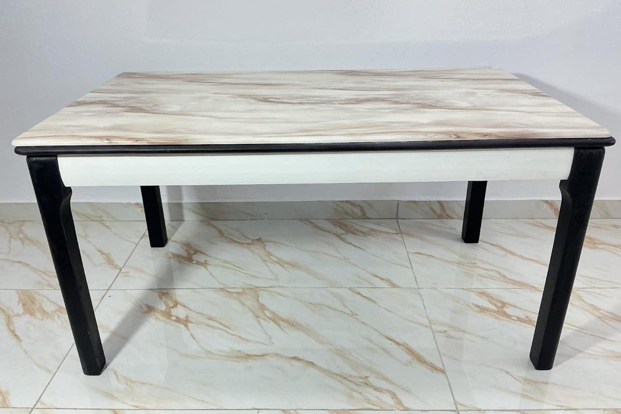
A honed marble, travertine, or limestone top on a wood base lets you place a contrasting wood right beside another without the two colliding. Stone also adds a cool, dense texture that makes both woods read warmer by comparison. (Planning a stone-topped table? See our dining table size guide.)
Fluted and textured surfaces
Fluting, reeding, and ribbed profiles break a wood surface into light and shadow. A fluted walnut sideboard against white oak paneling reads as texture first and color second, which softens the contrast. The same principle applies to caned or woven panels in rattan and paper cord.
Matching furniture to your floor?
Bring a photo of your flooring or a wood sample to our Cherlapally factory and see solid wood finishes side by side before you commit.
Plan a factory visit →
or WhatsApp us on +91 92465 96747
Quick Reference Pairing Matrix
| Dominant Base Species | Recommended Accent Woods | Buffer Material / Accent Hardware |
|---|---|---|
| White Oak | Walnut, ebonized oak, smoked oak | Matte black metal, honed travertine, wool rugs |
| Ash / Natural Maple | Walnut, teak, cherry | Brushed brass, cream bouclé, limestone |
| Dark Walnut | White oak, ash, rattan or cane | Aged brass, off-white linen, honed marble |
| Teak | White oak, ash, ebonized wood | Aged brass, jute rugs, terracotta |
| Cherry | White oak, maple, ebonized wood | Aged brass, warm white stone, wool rugs |
| Ebonized / Charred Wood | White oak, ash, natural maple | Brushed steel, pale limestone, linen |
Step-by-Step Styling Checklist
Run through these four checks before you buy any new wood piece:
- Identify the anchor. Name the dominant wood in the room, usually the floor or the largest built-in, and confirm the new piece belongs to the 20%, not a competing 80%.
- Check the undertone in daylight. Place a sample or photo beside the anchor near a window. If the undertones clash (pink against gray, orange against green), choose another piece or plan a neutral buffer.
- Squint test the value. If the new wood and the anchor blur together when you squint, the contrast is too weak. Go noticeably lighter or darker.
- Plan the repeat and the buffer. Decide where the accent wood will appear a second time, and what (a rug, metal, or stone) will sit between it and the anchor.